
Thursday, 27 September 2012
Bibliography
Bibliography:
- http://www.lewisham.ac.uk/media/269111/the%20lc%20dec%202011new.pdf - (Lewisham College Magazine.)
- http://www.midkent.ac.uk/uimages/File/Student%20Magazine%20Editions/StudentMagSep2012.pdf - (MidKent College.)
- Novum - World of Graphic Design (Graphic design magazines.) Dates: 03/11, 08/11, 09/11, 10/11.
Draft Contents Pages
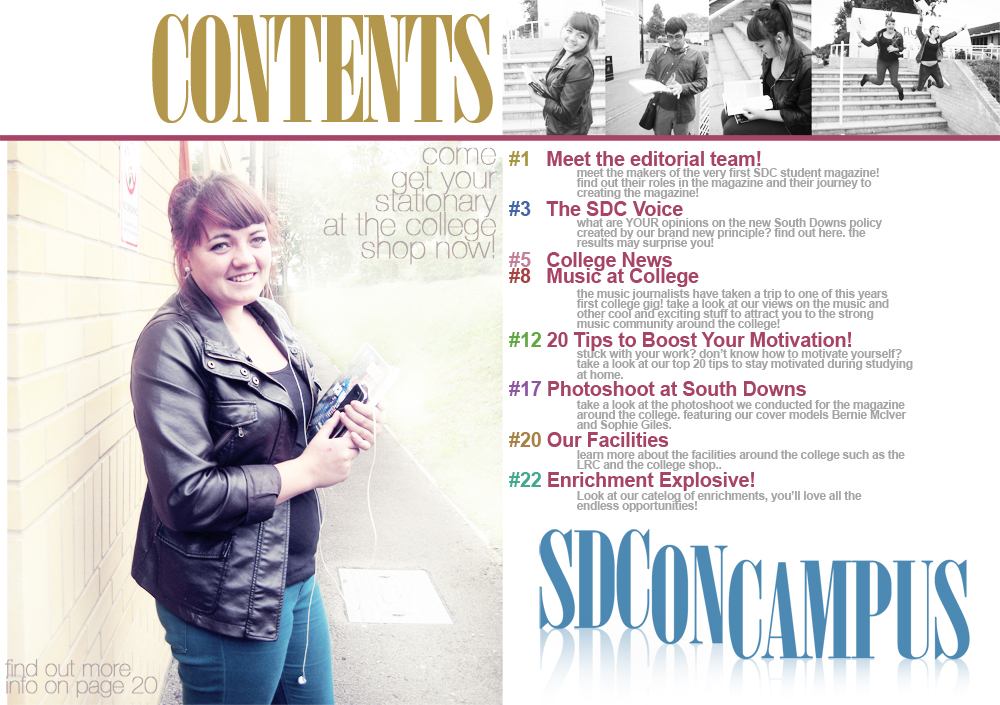
We have created two contents pages which match our main front cover designs. One is very sleek and sophisticated, the strip of black and white photos is a feature that has been replicated whilst the other is very bubbly using the bright blue and pink again. The content of our magazine will be interesting for students because it has hard news stories such as the case of the teacher running away with a student but also soft stories such as music reviews, film journalism and photoshoots. It will have an equal ratio of entertainment to informative articles and this is what we consider to make a successful publication.

Advertising


This is our main advertising flyer. It incorporates one of our cover designs but is very simple and doesn't give too much information about the magazine away. We deliberately designed our poster this way so it generates an air of mystery and interest. Conventional features such as the date of release and the phrase 'coming soon' are added so everyone knows it's purpose. We think it is eye-catching and easy to quickly consume in a hurry.

As the world of journalism and communication is changing we want to move with the times and have therefore made an advert that people can access on there phones. A large proportion of students own a smart phone or know somebody who owns one so by promoting the publication through this form technology as well as the printed sources, enhances its likelihood of being talked about.

Click here to see our tube station moving advertisement

Click here to see our tube station moving advertisement
Production Meeting
Friday 21st September
After a full week of work on the student magazine, where all members of the group were present each day, we have progressed immensely throughout the project so far.
All of the secondary research has been completed with a detailed analysis of different strengths and weaknesses in a couple of online magazines being discussed. After finding some influence from the results, we mind-mapped our thoughts and opinions for the best initial outcome of our own magazine. Forming these brain storms into a number of questions, we travelled around the college handing out 50 of these questionnaires in order to find out their varied opinions on the publication. We have also taken pictures of some graphic design books to help us emulate some page layout designs with regards to colour, structure and placement.
Recently, we have just begun to draft a number of front cover and contents pages. This will be continued throughout the next few days and upon completing 3 or 4 different versions we will go back out and ask peoples opinions.
After this production meeting we have a good idea of what jobs are still needed to be done. It was decided that to make sure our magazine drafts the best they can possibly can be we will take the designs and submit them to a small focus group, asking them questions about the outcomes. These questions were:
1. What is your favorite front cover design here?
2. What is your favorite contents page design?
3. Is there any aspects of the different designs that you would put together to make a better one? (take the font from one and put it with a layout of another etc.)
4. Do you like the colour of these designs or would you change any of the colours?
5. Do you have any other comments to add?
Tuesday, 25 September 2012
Draft Designs
Here are four draft design's for the college magazine, one of our team member made these designs with opinions from the other group members. The photography used is original photography taken by Kirsty Bate and Ethan Muscat. We tended to go for a colourful scheme so that the covers remain fresh and bright, not boring and dull.

This first design uses a large image of model Bernie, she looks like happy student and because this is a prominent photograph it is in colour. The colours follow what the model is wearing as well which makes it look attractive to look at. A side bar of original photography is also a structure we think people will enjoy. The typography is big, bold and fun, again something which grabs attention.

Design number two is a very different concept, one large picture is used as the background once more but the edges have been blurred to make the student's faces the focus point. There is a bigger variety of colour on this design, and each chunk of text covers a main section of the magazine (SDC Voice, College News etc.)

Our third design is extremely simplistic and the background is plain white. We are unsure as to the reaction this design will receive because of its basic nature but like the inclusion of circles and overlapping text boxes. Our own photography is something we are proud of because it reflects the ethos of South Downs as opposed to photographs of students that have been found on the internet.

Our final design is bright and colourful, pinks and blues are used effectively across the front cover and we are really proud of the logo at the top of the page. The typography stands out and looks interesting so we think that our student demographic will want to pick up the publication.
Primary Research, Questionnaire Results/Analysis
After looking at online magazines we could use for inspiration (see earlier post), we needed to test out any initial ideas on our target audience (college students.) We created a questionnaire that asks some of the important things regarding content, design and the actual name of the magazine. It was important to get good range of results across a spectrum of students so we didn't simply stay in the media department but got responses from people studying a variety of subjects (english, music, engineering, animal care, maths and more). We also reached a broad demographic in terms of age and sex. It wasn't exactly 50% boys asked and 50% girls but we were definitely wary of not to solely ask just one gender. Out of the 50 people we got a good mix of first, second and third years, also, ten recipients of the questionnaire were staff (admin, receptionists etc.) because we thought even though this is a student magazine that staff will pick it up and read it. Here is a visual representation of our findings.

The first question on our questionnaire revealed that out of 'college enrichments' (updates on glee club and sporting activities etc) 'college news' and 'performing arts news', almost half of all people were keen on seeing a segment on college news. We will be sure to have a page or two on things that students need to know because it is clear they are interested in that, but will also try not to only include these topics. Just under 20 people also wanted to see 'performing arts news', this could of been that we asked a number of students who partake in music, theatre etc. but it would still be nice to have a page linked to the performing arts as it is something which makes the college proud.

Out of the more 'casual' topics, music and gossip were clearly the most popular. From these findings we will definitely include the two most favoured along with a page or two about popular movies because this topic also received a number of votes. It is important to include a number of these 'soft articles' so that our student demographic want to pick the magazine up, there will of course be the serious topics, as mentioned above, but on the questionnaire results a lot of people talked about local reviews on music or a profile of a band who started at South Downs.


The main colours that were popular were red, green, blue and white, and will definitely be included in the basic colours of our design work. Black also had quite a strong number of votes, and usually is always included in graphic design pieces. The 'Other' colours section were in such a minority, with one or sometimes two people voting for a certain colour at a time, we have decided that it is highly likely that we will not use them in our design work.

When looking at this final graph the main answer by a considerable amount, as can be seen, is 'SDC On Campus'. As it had such a high vote it is the definite title for our magazine.
After completing and distributing our first
questionnaire we then found that some vital questions were not included on it.
We then decided to create a new questionnaire consisting of the two questions
we needed the target audience’s opinion on. We took the questionnaire in the
form of a tally, as it was quicker and easier to just ask the recipient.

Here are the visual representations of these tallies:

Here are the visual representations of these tallies:

This graph shows that the majority of the
target group feels that they would rather read the college magazine in an
online PDF format instead of a paper copy. Many said because it would be easier
to access at home as well as in college, they wouldn’t be able to loose it like
they would a paper copy and they also would not have to take up room in their
bags by carrying it around. But, some did say that it might be a good idea to
produce some paper copies to put in places like reception, the library, The
Coffee House etc, or other places where people are seated or waiting where they
have time to read a magazine.

The above results show that most people
would rather read the magazine in an A4 size instead of A5. Some said because
the stories will be all on one page and the images will be clearer and larger.
Subscribe to:
Comments (Atom)